I’ve always tended to be an early adopter of Apple’s software updates. I install the day 1 developer beta on my devices after WWDC each year, and then suffer the consequences of doing so (but hey, it’s really fun to watch the improvements between the early betas). I stuck with that trend this year on my phone, but when it came to my Mac, I held off. And while yes, I didn’t have a supported Mac any previous year, I promise that had I been in the position to, I would’ve installed the Sonoma or Sequoia betas when they released with no hesitation. Tahoe, however, was different.
I’m not a huge fan of Liquid Glass as a whole, but for the most part I’ve come to terms with the fact that this is how things look now (for better or for worse) and was at least moderately curious about it when it was new. On paper, I like that it makes things a bit less flat, but there are so many various glaring issues with it across all of Apple’s OSes that I can’t possibly say it’s good. Accessibility is rough, and UI elements break or behave weirdly in one way or another all the time.
Either way, the glassy UI components weren’t my biggest concern with the design refresh. Instead, what got me was the icons. (And in my case, I mean the app icons. But don’t worry, I recently discovered a great article by Nikita Prokopov talking about Tahoe’s other icon problem.)
I don’t find the *OS 26 icons to be particularly amazing on any platform, but at least on iOS the new icons aren’t super different from the ones that we’ve had in use over the past few years. iOS icons haven’t been quite as intricate in a while now, so I can live with at least some of those (though some were subjected to the same downgrades as their desktop counterparts that I’m here to address). On macOS though, the new icons brought changes that immediately bothered me. macOS icons have had a unique style to them dating all the way back to the release of OS X 10.0 (2001), and Apple’s new designs seem to be throwing all of that away.
What We Had
Before we can talk about Tahoe’s icons, we need to talk about what they replaced: Big Sur’s icons. When Apple last dramatically redesigned the UI in macOS 11 (2020), the icons followed suit and got a fairly iOS-inspired look, with many icons using virtually the same icon as their mobile counterparts, but with an added sense of depth. It was a good push towards making the icons uniform while still preserving many of the extra more intricate details that has always made Mac icons unique.
And you don’t just need to take my word for it. When revealing macOS Big Sur during WWDC 2020, Apple themselves said, “But we also love that Mac icons have a deep history and a distinct look and feel. So we’ve retained many of the highly crafted details and the playful elements that make Mac icons unique.”[WWDC 2020] These are details that have existed through most of the OS’ history, so suddenly going back on that just 5 years later and removing many of them would be crazy, right?
…right?
Let’s pause and take a quick look at an example of this style. GarageBand is one of my favorite examples of what I consider to be a good icon redesign. The GarageBand icon that had been in use prior to Big Sur was a 3D guitar in front of a very stereotypical depiction of an amp. Like most OS X era icons, it was entirely freeform with just the two shapes next to each other, without any sort of background or constraints. When they redesigned it, they simplified the amp down to four drivers on a black square, and made that square fit within the new icon constraints, but then also kept the 3D guitar and let it break free from the icon’s frame.
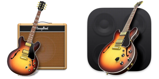 An example of a good redesign that made it fit the new design language while still preserving the details of the original icon.
This icon is a prime example of the big design concept that I absolutely adored from the Big Sur icon style: it uses a rounded square base that fits within the constraints of a rounded square icon, but then has a 3D element that travels outside of that outline. It does a really good job of allowing for overall consistency without removing the fun details that made these icons memorable from previous versions of macOS. And GarageBand was far from alone, the majority of macOS icons that had some sort of eye-catching 3D object in them kept it in the transition to the Big Sur style.
![]() An assortment of good icons from Big Sur that follow this pattern. Rounded square background, 3D object in front.
An assortment of good icons from Big Sur that follow this pattern. Rounded square background, 3D object in front.
This felt like a really good place to land when trying to push the designs of iOS and macOS closer together. The app icons follow the same basic design between both platforms, but the less powerful mobile device gets the simpler and flatter icons while the full desktop experience allows for higher power applications, and therefore more detailed icons.
The 3D objects also make identifying apps quicker, at least for me. When you force icons to all have the same basic shape, several icons of the same color that are near each other can be a little harder to identify at a quick glance. But when you have a big guitar, or a hammer, or hey maybe even a crowbar (looking at you, Hex Fiend, which is not first party but just goes to show that developers followed Apple’s lead here), you might be able to notice that object and identify the app faster.
But then, along came Tahoe. In macOS 26, the rounded square template isn’t a suggestion anymore; Apple decided that from now on, it was a hard requirement. Icons that don’t fit within those constraints are scaled down and placed on a grey, square background. Unfortunately, this change meant that many of the previously mentioned details had to go away, because 3D objects were no longer allowed to float outside of the square. This meant a new wave of redesigns, and my first wave of concern.
What They Gave Us
I think that talking about Finder has already been done to death, so I’m not going to dwell on it for long. But at the same time, it would be wrong of me to not mention it at all, given how infamous the situation became. Finder was one of the first Tahoe icons I properly saw, and I was immediately put off by it. Myself and many, many others were highly critical of Apple’s bizarre decision to swap the sides of Finder’s face.
Historically, Finder has always had a bold blue on the left, and either a lighter blue (from Finder’s introduction through OS X 10.9 (2013)) or white (from OS X 10.11 (2014) onward) on the right. Of all apps to make such a dramatic change to, Finder was kind of an insane choice. It’s absolutely the single most recognizable icon in the entire operating system, and the face has been colored the same way since its introduction in System 7.5.1 from 1995.
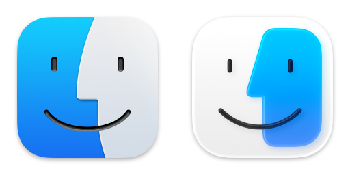 Immediately screwing up Finder in beta 1 was a bad sign for the future.
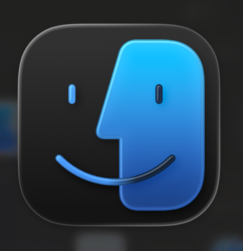
If the questionable redesigns had ended there, I would’ve been perplexed, but ultimately fine with the whole ordeal since they did swap the colors back to the way they’re supposed to be in 26.0 Beta 2. (Though perplexingly this is only true for the light icon, the dark icon still has the blue on the right side. I guess this is so that the lighter half stays on the right?) Unfortunately, there was still a large catalog of app icons that Apple had decided to tarnish.
Before we get too deep into this, I do want to clarify my purpose here. I don’t just mean to bitch and moan about how the new icons look bad and how I don’t like them and how change is scary and should never happen. Change can be good, and I hope to illustrate that by explaining how much I genuinely loved the Big Sur redesigns. For the Tahoe icons, I want to explain my exact reasoning behind why I feel so many of these icons fail to both uphold their legacy and convey proper meaning to the user. This is a two-fold problem, because many of the redesigns both don’t hold up when compared to their predecessors, and also don’t hold up as an icon in a vacuum.
Let’s continue with Xcode, which I consider to be the most egregious example. (And I develop iOS apps so I have to stare at it a lot, giving me plenty of time to build up my frustration over it.)
Here’s the progression of the Xcode icon over the years, from 2005 until now:
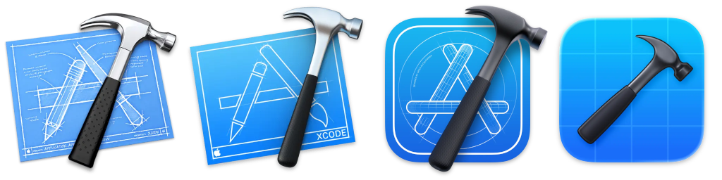 Omitted for space reasons is the original Xcode icon from 2003, but it follows the same basic design as the 2005 icon. Does one in particular maybe feel a little out of place to you too?
Hmm.
The Xcode icon being a blueprint has always felt like a really clever design choice to me. It’s literally the blueprint for your app. And in Big Sur, I think it was actually one of Apple’s best icons overall. It’s easily recognizable, and has plenty of small details put into it, like the circle radius around the App Store logo and the lines on it that give it a 3D look.
But in Tahoe? Well, it’s a hammer. The grid behind it kind of looks like a blank blueprint, but even then it’s a blank blueprint. The visual motif of the App Store was completely removed, and with it went the icon’s history. The hammer might be iconic, but a hammer alone does not an icon make.
This change to the Xcode icon also allows me to illustrate my second concern, that being a lack of a clear meaning. If you had no idea what an Xcode was, but you looked at any of its icons prior to the one used in Tahoe and put some good thought into it, you could most likely come up with the correct answer that this is a tool for making apps. Especially if you put it right next to the App Store icon to see that visual motif side by side. The App Store is an A, this is the blueprint for that A, they’re obviously related somehow.
But could you do the same with the Tahoe Xcode icon? I mean seriously, think about it. If you had no idea what Xcode was for, I don’t think you would reasonably be able to deduce its purpose from looking at the icon alone. I think you could be equally convinced that it has something to do with designing a floor plan as you could that it was for making apps (and there are apps for making floor plans on macOS so that’s not entirely unbelievable).
Obviously it’s not a requirement that every single app must have an elaborate icon that perfectly conveys what the app is used for with no room for ambiguity, but I think that it should at least be clear enough that you can take an educated guess. And I think that it’s especially ridiculous to go and simplify that meaning away when you’ve been communicating it well for the past 20 years. They figured out how to perfectly represent the tool used to make apps. Why go and abandon that?
Who Needs Meaning, Anyway?
Aw crap hold on, my sink is leaking again. Anyone have a wrench I could borrow?
 Disk Utility, ColorSync Utility, AppleScript Utility, and Wireless Diagnostics. Note that the dark mode Disk Utility and Wireless Diagnostics icons were manually recreated from their components because extracting Tahoe icons is weird.
Oh thank god.
I’m not going to try and pretend that most of these icons were anything special before, because the latter three are all simple configuration utilities of one form or another that were tools behind a badge of some kind. Now, in Tahoe, they’ve been made completely uniform. I mean really, besides changing the gradient on the wrench a little bit for whatever reason, the main difference between these three icons is the, relative to the size of the icon as a whole, fairly small hexagon in the center.
For the latter three, conveying meaning isn’t quite as important here, so I’m going to say they’re actually not bad. Editing your color profile, dealing with AppleScript files, and diagnosing WiFi issues aren’t really things that are super easily conveyed through the app icon alone. Credit where credit is due, a rainbow, a little AppleScript icon, and the WiFi symbol are probably the best we could expect, and I think that they’re okay in this context. These three were generic before, and now they’re generic and uniform (since not all of them even got Big Sur style icons), which I’d say is a net positive.
But then there’s the new player that joined this set of matching icons in Tahoe.
Disk Utility?? What about that first icon conveys Disk Utility? It’s just an Apple logo on a white background. Let’s pause and look at these side by side, just to make sure that we’re on the same page about the before and after:
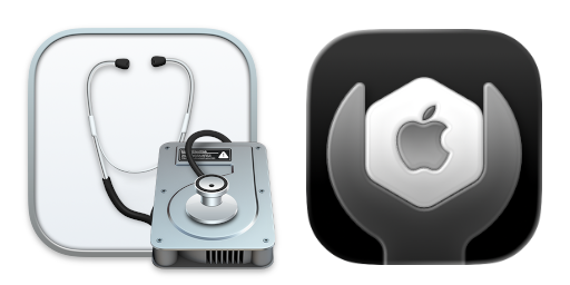 Disk Utility might not have been a looker but like… c’mon guys.
Just like Xcode, Disk Utility is another example of both an icon’s legacy and meaning being entirely stripped away. The old icon was clearly a tool for dealing with disks; it’s a stethoscope on a hard drive, and that’s what it has always been since its upgrade from Disc Copy to Disk Utility in OS X 10.3 (2003). But what the hell does an Apple in a wrench mean? You can maybe guess that it’s for some form of system configuration, but disk management would not be at all on my radar if I didn’t already know what it was. There aren’t any disks.
Uniformity between the simple configuration apps is good. They’re all for one specialized task, but are all configuration of some kind, so I like that they use the same base with a different center to indicate the specific purpose. But Disk Utility isn’t that. It’s a fairly major app that the average user is actually likely to interact with and be at least moderately familiar with. Not everyone will need to modify their color profile or manage their expansion slots (it wasn’t included in the above collection of icons for space reasons, but the Mac Pro-specific Expansion Slot Utility also follows the same format), but I would say at least a healthy majority of users will need to format a drive at some point in their time using macOS.
My point is less that format of the icons itself is bad, because I actually think it’s kinda neat, but that this is a really poor application of it. A commonly used app shouldn’t have a generic looking icon that could blend in with other really specific and rarely used apps, and especially shouldn’t have an icon that does not inherently represent what the app does whatsoever. I mean seriously this still really bothers me, how does an Apple logo alone represent disk management?
Alright, I have one last major example to show off, and then I think I’ll have made my point well enough. I give you, Preview:
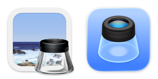 Hey, it’s Inkscape! Oh, wait, that’s not an inkwell.
The Preview icon from Big Sur is fun, it’s the same example photo that they had been using since OS X 10.10 (2014) with a very clear desk paper magnifier thing that, while looking in Assets.car to extract the icon, I learned is called a loupe. It’s also fun that it’s outside the icon’s frame, because it’s like you have the loupe sitting on your desk ready to look at a real printed photo.
Meanwhile, in Tahoe, they have completely abandoned the example photo and just have the loupe on its own, which, before anything else, I just feel is pretty bland, right? Additionally, while you can tell what it is and read the little “PREVIEW 10X” when it’s blown up like it is here, you lose all of that clarity once you scale it down to an actual app icon size. I’ve been seeing it on my phone for almost a year now, and on my Mac for several months, and I still see it as an inkwell first every time I look at it. Maybe this is just me, but I mean it’s the right shape and I’ve come to expect to see a photo in Preview’s icon so I don’t really see this and think “Preview”. It gets even worse when using dark mode, because the black background and darker glass almost makes it look (again, to me at least) like there’s ink inside!
Maybe the ink thing really is just me. But either way, you can’t deny that a lot of the meaning has been lost. I’m not going to claim that the average person was able to recognize the loupe and knew what it was for when looking at the Big Sur icon (I mean I didn’t even know what it was called until I started writing this article), but at least with the context of the photo you could make a reasonable guess. And again, that’s what I think the standard should be. An icon doesn’t need to provide a super detailed look into what an app is for, but it should, at worst, let you take a pretty reasonable guess at what the app you’re about to launch does. You might not know what a loupe is, but the photo means you’d probably guess that Preview has something to do with images, and from there you might even guess that it’s specifically for viewing them.
Big Sur and all the macOS versions that came before it did this well. Tahoe does not.
The macOS Icon Legacy
And now we arrive at the part where I need to summarize my thoughts.
I understand that the design of app icons is a somewhat subjective matter. Not everyone is going to agree on what design choices make a good icon. But I also know that a large portion of macOS users are very fond of the OS’ design, and the way that it has evolved while still maintaining its identity over the years. I might only be about 50% of a Mac user, but I’m still certainly one of those people. And regardless of your thoughts on macOS as a platform, you can’t deny that the way it looks is a huge part of what the operating system is, and that a lot of people are really quite fond of it.
While the general look and feel of the operating system is incredibly important, people aren’t going to specifically remember the corner radius of a window or the translucency of the sidebar as much as they’re going to remember the icon of the app that they saw them in. A small picture is much more specifically memorable than a general design language.
For me personally, I grew up on good old OS X Snow Leopard (10.6, 2009). I haven’t used it properly in years now, but its icons still stand out in my head. I can picture the glossy look of things like Time Machine and Safari, and the 3D objects like the DVD Player remote and the Numbers bar graph. I was only barely using macOS, mostly just by messing around with Catalina on an old Mac via dosdude1’s Catalina Patcher, when they announced Big Sur. But even still, I was excited to see that despite changing the whole interface, they were still preserving the key bits of the icons I remembered seeing every day as a kid. I was certainly worried that they wouldn’t after hearing rumors of the impending macOS redesign.
I’m aware that there are bigger concerns with macOS Tahoe than its app icons that desperately need addressing. Like I mentioned at the start of the article, I’m aware of how much of a disaster Liquid Glass has been. But I still can’t help but feel sad seeing something I was so familiar with and that had roots going back to several years before I was even born (!!) get erased. Is there any chance at getting my app icons back come WWDC 26? Probably not.
But I can still hope.